Make Your Mobile App Or Game A Great First-Time Experience
2019-04-10 | CAROLINA SILVANDERSSON
If you want to improve user experience, mobile app localization is an important factor. To make mobile app or game localization easier, preparing for app localization during app development is a good idea. There are a few other important things to keep in mind when working on user experience.
Plan before developing. Make your mobile app a great first-time experience & develop a mobile app or game your users will love. In this blog, I will give you 5 tips on how to create a user-friendly mobile app. Usability design affects your mobile app’s downloads and uninstalls, so keeping the interface clean and simple is a great start.
Note: Some images are from web pages, but are applicable to mobile apps.
3 key values that shouldn’t be ignored when developing your mobile app:
Functionality - Does the app work? Is it too slow? Do the links work? Clicking at the same button five times without response will probably result with your app ending up in the trash bin.
Consistency - Consistent performance is simply an app that doesn’t crash. Apps that don’t perform as expected are usually uninstalled apps, and that’s not good for your ASO.
A consistent app is also an app that consumes as little space and power as possible from the user’s device. Every time a user receives that annoying message about how to “manage your storage in Settings” he or she will usually start deleting some pictures, and when that’s not enough, continue searching for apps that take too much space. If your app is near the top of that list - there’s a high risk your app will be removed together with the blurry pictures from last Friday’s party.
The same goes with battery usage. If your users suddenly need to charge their battery twice as often as before and find out it’s your app causing this frequent low battery indication - then it’s likely your app will need to go.
Connectivity - Your app should easily connect with social media. This makes it easier for your brand awareness to spread. In some markets, like the Korean market, you need to have a social component in your app to succeed.
Reward your users
The principle of variable rewards: Don’t reward every time. Think of slot machines. They don’t reward all the time. Instead, they trigger the user to try again. And again. And again and again.
On average, Americans usually check their smartphones 52 times a day while some do it around 300 times daily! What triggers us to enter our pin code dozens of times a day? Our wish to be rewarded.
BJ Fogg (Persuasive Tech Lab), states that three things need to happen at once to get a behaviour to occur:
The user has to be highly motivated.
The user must have the ability to do it.
The user must be triggered to do it.
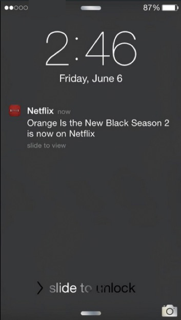
To get a reaction, you need to start with the trigger and then motivation. Look at Netflix: they trigger the next episode to motivate the viewer to watch another episode.
This shows the importance of having a notification system and making these a vital part of the user experience.
Another of Fogg’s theories is this: an app has to meet the user’s basic emotional needs before the user is aware of them. When grabbing your smartphone from your pocket to check Facebook, Twitter or the news, you’re actually bored. But you’re not aware of that yet. Looking at the screen is an automatic reflex; your brain wants to be rewarded with something juicy.
1. Do not reinvent
Be familiar
Stick to the formula and eliminate confusion. Users bring their own experience and expectations from other apps, so make sure to follow these standard rules. Being familiar means that users know what to do, what to expect and how to behave when clicking, scrolling and trying an app. If you want to bring in a new function that’s totally awesome, then you need to test it. Test it on others and make sure they agree with you that the brand new function is as awesome and intuitive that you think yourself.
For instance, keep the “Continue” or next button to the right, not on the left side, because this is what will be expected. UI elements are usually placed at the bottom. This makes it easier when holding the phone with one hand and making choices with your thumb.
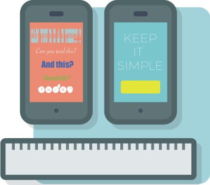
Do you remember KISS - Keep It Simple Stupid? The same applies to the app design. Skip a cluttered interface. A few colors and one font is a good rule. This helps your users with decisions because they want to know what to do and where to click asap.
Remember! Keeping it simple doesn’t mean that everything has to be minimalistic. It means that a new user can open the app and start using it right away.
Time spent with the phone is typically when you’re doing something else instead: waiting for the train, sitting on the train, sitting in the toilet, attending a meeting. When someone checks an app during these brief moments it’s important to be able to continue where they left off the last time “just checking”. App users can roughly be divided into two groups:
Bored: When waiting for the bus, and picking up the phone to continue where they left off the last time: Candy Crush, Facebook, etc.
Stressed: Running to the bus and texting at the same time: map, timetables, Messenger.
Many popular apps have skipped complex menus to focus on a really simple user interface instead. Even mobile games can be simple. Check Candy Crush. That’s a game you can play with one hand, start and quit whenever you wish to, and you can kind of do other things while playing.
2. Right color in right place
Red shouts NO! Use the red color reservedly. Avoid red buttons.
Does the user understand what to do? Clarity is essential. Less color and a minimum of text helps your users to navigate easily. The interface tells them where to click and where to find the next step. The interface should not confuse users.
Print Studio - an app with many images (it’s a photo print service) and colors, manages this very well. They have faded the colors a bit to make the call to action clearer. Even though the button is green and the text above it red (red usually screams NO!) they are managing the onboarding process pretty well.
A large number of our population are color blind. Make sure to have colors and text in colors that are readable for all. \\\\[Here](http://www.color-blindness.com/coblis-color-blindness-simulator/) you can upload images to a color blindness simulator. Make sure you’re not using colors to show important things.
## 3. Show me the meaning
Every click, every link, every button must lead to something somewhere else. Don’t create a button where the view looks just the same after being clicked. That’s just confusing.
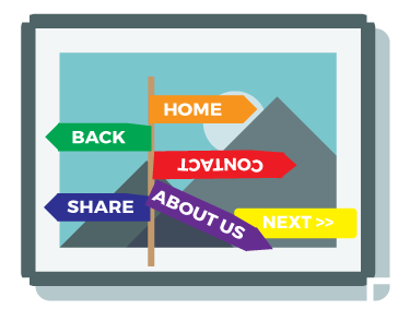
Where am I?
Users do make mistakes. Always make sure it’s possible to go back and make changes.
With help from breadcrumbs or steps, show the user where in the process he or she is.
## 4. Icons not text
Before you start coding, grab a pencil and sketch your elements on a paper to see how your user flow works. It is easier to make changes with an eraser then moving stuff in code.
Picture having a grid. That way key elements end up at the same place and users recognize what to do.
Skip text where possible (it’s possible more often than you think) and use icons instead.
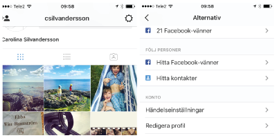
Remove clutter, and group related elements. Account is a good place to put things like settings, password, sign out etc. Instagram makes it really simple. No text at all, just click the wheel, and then a long list with loads of options shows up.
Make sure the text is readable. Don’t use a new cool font where the J looks like a U. Don’t use fancy words. Here’s not the right time to show your Scrabble skills. Keep it simple. Use simple words that everyone understands, no matter if your user is young, old, a person on the run, or a person that just learned a new language.
5. Tested on different platforms
Make sure your app works on different platforms. Test it thoroughly. Really really thoroughly. Don’t assume it will work on iPhone 8 if it’s totally working on iPhone 7. Borrow an Android phone, test with different browsers, click every button there is to click and submit every possibility to submit.
Can you walk and talk at the same time?
Go outside. Don’t think everything’s working fine because it’s working in your office with your super speed wifi. Go to the bus station, go visit your grandma, go to the woods where you’re happy to find 3G between two oak trees.
Stress your app. Connect and close down - fast. Imagine you need to board a train just as you opened your app. Test your app and use it like you would use it IRL. Because a real user won’t wait for an app to open. If nothing happens in less than 3 seconds, a standard user closes down - they don’t want to wait for the page or app to load.
Read the screen and walk at the same time. Is the font clear enough? How about the pictures - are they clear enough?
Can you read your screen in sunlight?
Can you click the button you’re aiming for with your finger? Or are you accidently pressing two buttons and a link? The rule of the thumb - the button needs to fit the thumb.
Do your friends, family, parents and 10 year old cousin understand what to do? Ask them to test your app.
What happens if you receive a call while using your app?
Test every possible situation.
When your user experience is set, check how your app page will look like before going live. First impressions last. Give your icon some extra care. Your icon needs to stand out among others and show what your app does.
Mobile app localization is your next step to make a great first time experience for users around the world. Otherwise you risk launching an app that’s not available for all. Localizing your app, is not only about translating app text; to fully reach new markets, images, keywords, description need to be localized.
Some Asian countries are absolute global leaders in the gaming industry: for instance, China, Japan, and South Korea are all in the top 4 by revenue after the US. Other markets (Southeast Asia and the Middle East) are some of the most rapidly growing ones, especially in the sector of mobile gaming.
Game localization and translation can be challenging, especially when deciding which top languages to translate games into. Choosing between popular European languages or targeting Asian markets may seem daunting. Keep reading to learn about essential languages for translation and important considerations for game localization costs.